Introduction
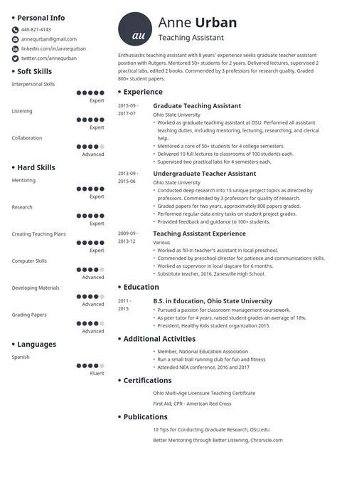
In the competitive job market of 2025, crafting a resume that stands out is crucial. The font you choose for your resume plays a significant role in creating a positive first impression. This article delves into the essential factors to consider when selecting the best font for your resume, providing a comprehensive guide to font choices that will enhance your job application.
Why Font Matters
- First Impressions: The font you select creates an immediate impression on the recruiter. A well-chosen font conveys professionalism, credibility, and attention to detail.
- Legibility: The primary function of a resume is to convey information clearly and concisely. A legible font ensures that your resume is easy to read and comprehend.
- Personality: While the content of your resume should be objective, the font you use can subtly convey your personality and style.
Key Factors to Consider
When choosing a font for your resume, several essential factors should be taken into account:
- Readability: Opt for fonts with clean lines, ample spacing, and high contrast to ensure readability.
- Professionalism: Choose fonts that are widely recognized as appropriate for professional documents, such as serif fonts (e.g., Times New Roman) or sans-serif fonts (e.g., Arial).
- Consistency: Maintain consistency throughout your resume by using the same font family for all headings, body text, and contact information.
- Personalization: Consider your personal brand and the industry you are applying to when selecting a font. A more creative font may be appropriate for some industries, while a more traditional font may be preferred for others.
Top 10 Font Recommendations for Resumes
Based on surveys and expert recommendations, the following are some of the most effective fonts for resumes in 2025:
| Rank | Font Name | Type |
|---|---|---|
| 1 | Georgia | Serif |
| 2 | Times New Roman | Serif |
| 3 | Calibri | Sans-Serif |
| 4 | Helvetica | Sans-Serif |
| 5 | Arial | Sans-Serif |
| 6 | Garamond | Serif |
| 7 | Cambria | Serif |
| 8 | Baskerville | Serif |
| 9 | Verdana | Sans-Serif |
| 10 | Century Gothic | Sans-Serif |
Font Size and Spacing
- Font Size: For body text, a font size between 11 and 13 points is generally recommended. For headings, a larger font size (e.g., 14-16 points) can be used for emphasis.
- Line Spacing: Double or 1.5-line spacing provides ample white space and improves readability.
Font Optimization for ATS
- Applicant Tracking Systems (ATS): Many companies use ATS to screen resumes before they reach human recruiters. Certain fonts may be more compatible with ATS, ensuring your resume is parsed correctly and considered for the position.
Future Trends in Font Selection for Resumes
The future of font selection for resumes is expected to evolve with advancements in technology and changing job market trends:
- Adaptive Fonts: Fonts that adjust their appearance based on screen resolution and device type may become more prevalent.
- Personalization: Resumes tailored to specific industries and job roles will likely lead to increased use of personalized fonts that reflect the candidate’s brand and skills.
- Emphasis on Readability: The focus on readability will continue to be paramount, as employers prioritize efficiency and clarity in reviewing resumes.
Conclusion
Choosing the right font for your resume is essential for making a strong first impression and communicating your professionalism. By considering factors such as readability, professionalism, consistency, and personalization, you can select a font that enhances your resume and increases your chances of success in the job market.
Remember, the font you choose is just one aspect of creating a compelling resume. Pay meticulous attention to content, formatting, and overall presentation to ensure your resume stands out and achieves its intended goal: securing your dream job.


